Leading Consumer Goods Manufacturer
Jan 2025 - May 2025
Research: Miro, MS Forms
Design: Figma, Adobe Illustrator
01 Lead UX Designer
02 Developers
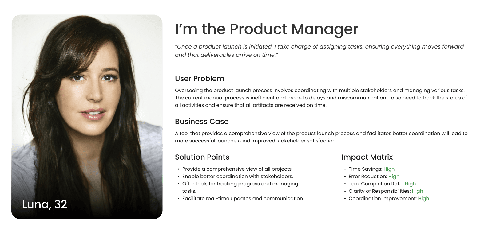
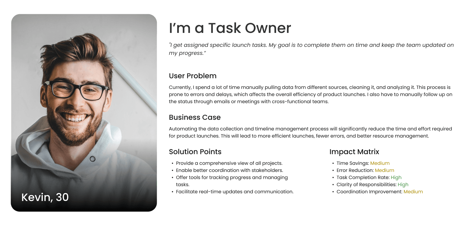
01 Product Manager
Lead UX Designer
I led this project as User Experience Designer, journey from initial exploration to final implementation, which included understanding the brief, conducting research, ideating, designing, and prototyping. Throughout, I maintained close collaboration with the product manager, end-user and stakeholders, also partnered closely with engineers.

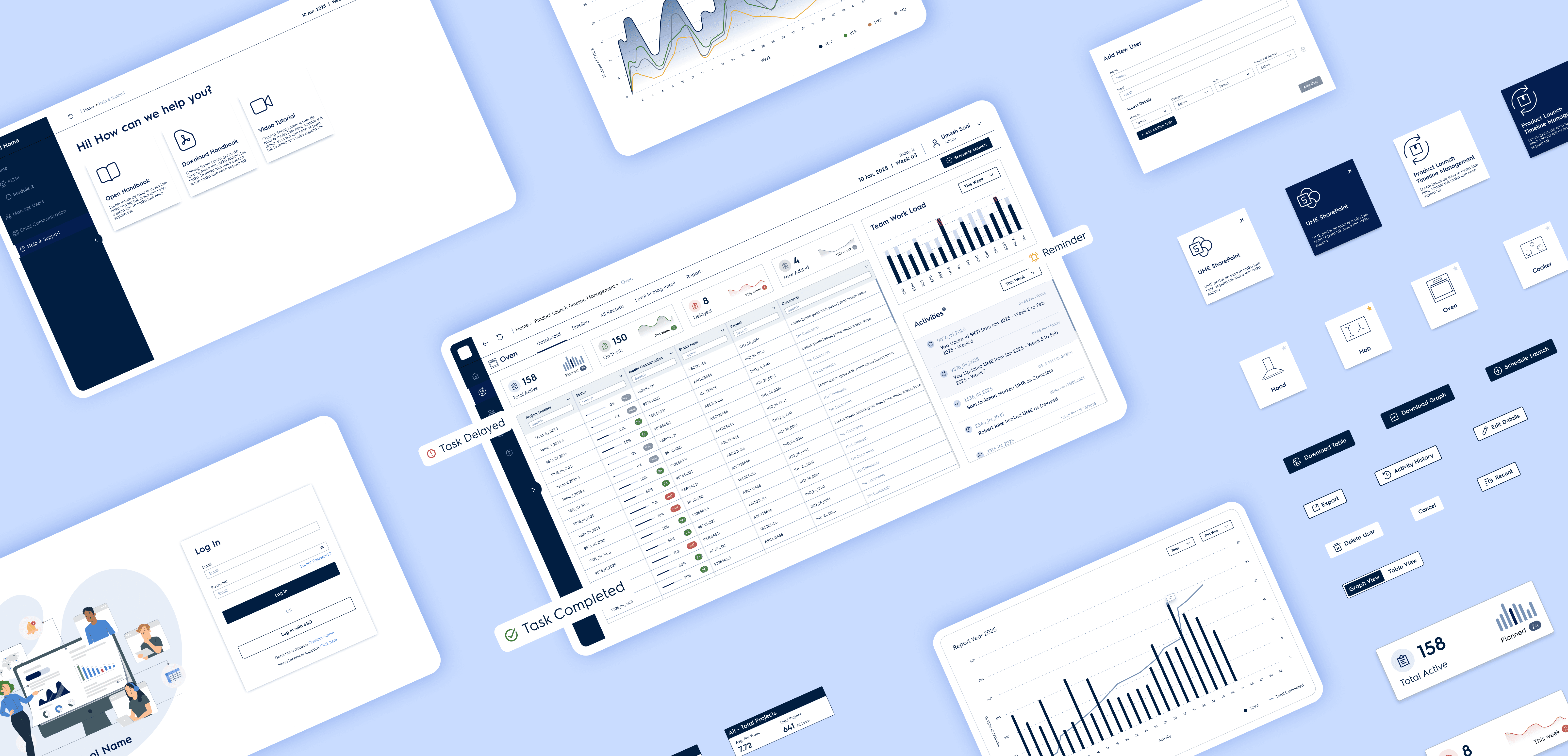
A leading manufacturer set out to simplify and automate the way they managed product launch timelines. Previously, the process relied on juggling Excel sheets, long email threads, and manual updates—often resulting in delays and Errors.
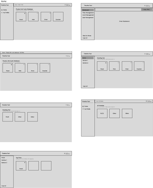
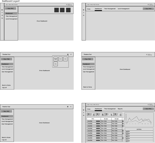
I joined this journey as the UX Designer, helping design Track Launch—a centralized platform that brings all stakeholders together and makes the product launch process more efficient, transparent, and collaborative.
Manual workflows
Launch preparation required data to be pulled from multiple sources, cleaned, and organized manually—causing delays and errors.Lack of central visibility
Teams lacked a unified platform to track progress, timelines, and responsibilities across stakeholders.Poor coordination
Communication relied heavily on email threads and spreadsheets, leading to misalignment and missed deadlines.
Less Busywork, More Focus
Automating repetitive tasks meant teams could stop wrestling with spreadsheets and start focusing on what really matters — getting products out the door smoothly.Clarity at a Glance
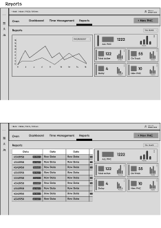
A central dashboard gave everyone a bird’s-eye view of where things stood. No more digging through emails or guessing who’s handling what.Clear Roles, No Finger-Pointing
With role-based tasks, responsibilities were crystal clear. Everyone knew their part, which led to better follow-through and fewer last-minute surprises.Fewer Mistakes, Fewer Delays
Built-in checks ensured that all the right files and data were in place — before it was too late. That meant fewer launch delays caused by missing or incorrect info.Saving Time = Saving Money
By streamlining the entire process, we helped cut down the hidden costs of miscommunication and rework — which adds up fast over multiple launches


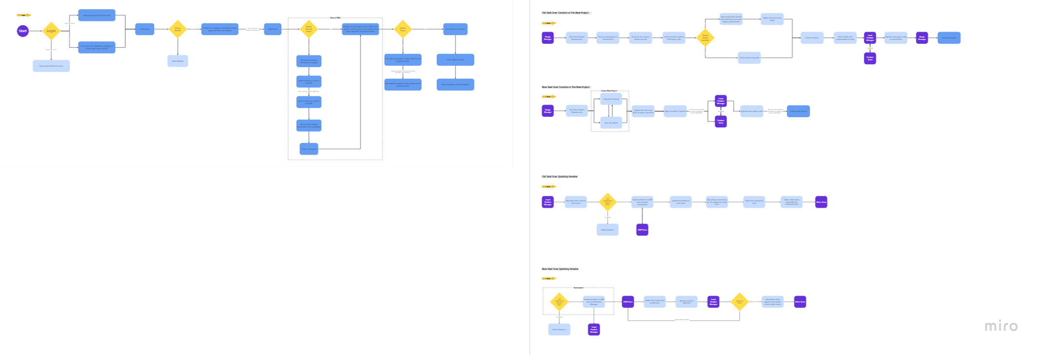
Create New Project → “Before Design Intervention”

Create New Project → “Optimized Flow”

Update Timeline → “Before Design Intervention”

Update Timeline → “Optimized Flow”


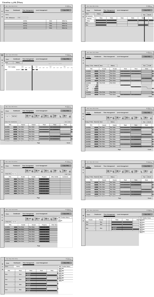


Stakeholders appreciated the dashboard but suggested deeper filtering options for timeline views.
Instead of just showing delayed or on Track, can we also show which stage the task got stuck at?
In same timeline row can we show the comparision of last and latest timeline?
Can we also have a tab for level management to create level presets?


Collaboration is everything – Working closely with stakeholders, end users, and developers helped align design with real needs.
Simplicity is powerful – Turning a complex, scattered workflow into a streamlined tool proved that good UX can untangle anything.
Design-Dev handoff matters – Guided developers on Figma’s developer mode, making implementation smoother and more efficient.
Empathy leads to impact – Observing how users interacted with the old process helped design a solution that truly fit their workflow.
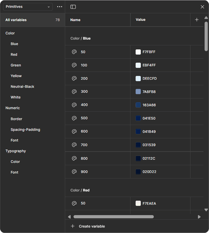
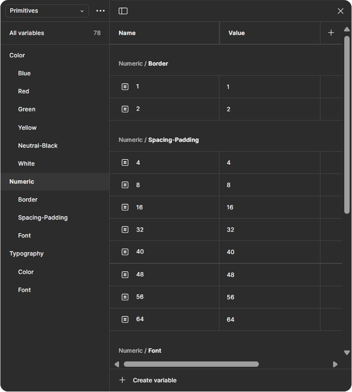
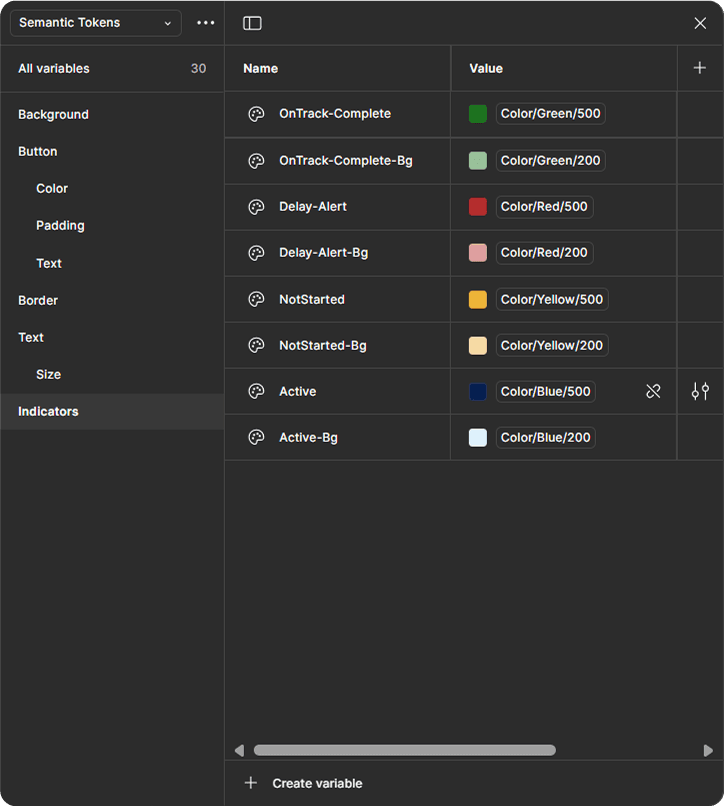
Scalability starts early – Building a robust design system laid the groundwork for future feature expansion.